Very Belated Update
The tariffs are back and so am I

Hi everyone, sorry it’s been so long since the last post. I’m still working on that explanation of the swap spread trade, but had to put it on hold for a while to work on other stuff. In the meantime, our 90 days are up, and the day of reckoning has finally arrived, sort of. On July 4th, five days before the 90 day pause was set to expire, Trump announced his “inclination” to send letters with rates on them to every country that hadn’t yet secured a deal with him. All of them but three, then.
Since this has turned out to be kind of a markets-focused retelling of the Liberation Day story, I’m going to track the reactions to this month’s developments in stocks, treasury bonds and the dollar as I recount them. I’m mostly doing this so that we can marvel at the transformation that market sentiment towards Trump’s antics seems to have undergone over the 90 day pause. Announcements the likes of which nearly sent the entire global economy into a tailspin three months ago are coming out thick and fast, crashing in waves into financial markets which, if you remember my holiday update post, were beginning to show disturbing patterns of correlated weakness in government and private debt, equity, and the currency itself. The results have been bizarre.
But first, where were we heading in to July 4th? Lets have a look at some basic charts to give us a very broad idea of the story;
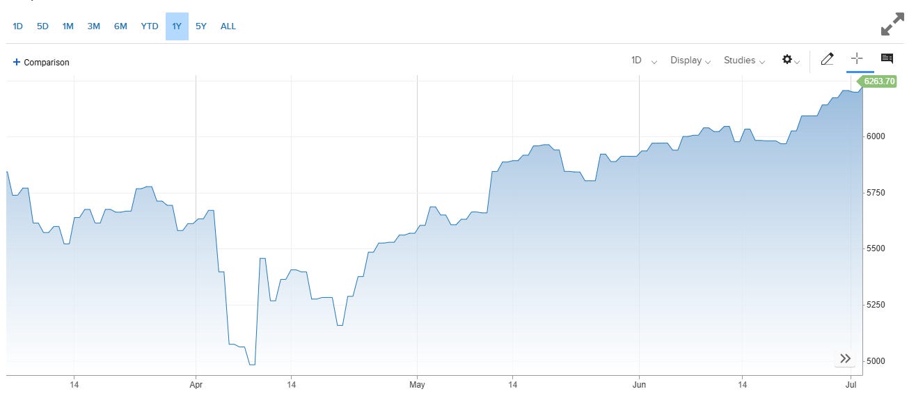
An index of the S&P500 from March to June
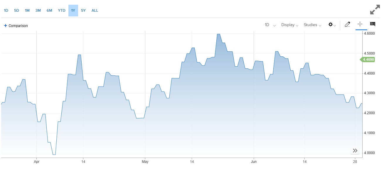
10 Year US Treasury Yields from April to June
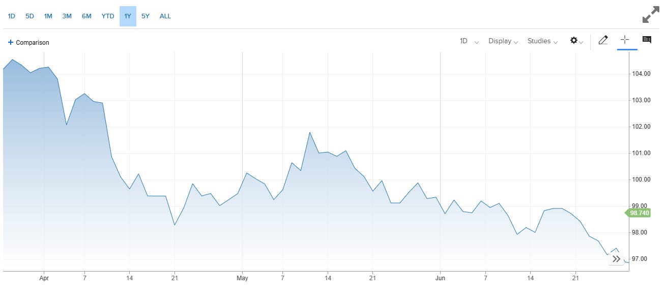
An index of the relative value of the US Dollar From April to June
God there’s a lot to say about these charts, and I really can’t hope to cover everything that’s happened in the last two months here, particularly the complexities around America and Israel’s 12 day war against Iran. In very broad strokes, though, the sort of interlocking system of counterbalances that I have referenced a few times in this series between stocks, treasuries and the dollar seems to have been mostly reestablished. Treasuries appear to have regained their status as a safe asset, with yields dropping in concert with systemic frights from the trade war and rising with the steady stream of pleasant surprises from US jobs and spending data. Those brief rushes into treasuries have not come with retreats from equity, however. Instead, a visibly persistent dip-buying habit in the markets is causing generalised US buying sprees around alarming news with wearying regularity.
The odd thing about these charts, then, is the state of the dollar. The voracious appetite for US assets evident in the other two charts isn’t strengthening the nation’s currency. Instead, the dollar headed into July in a state of gentle decline that seemed to sharpen suddenly towards the end of the month, exacerbating what has been the currency’s worst first quarter since 1973. This trend is so pronounced that despite the record-breaking ebullience of the stock market, adjusting for the dollar’s weakness, US investors are actually coming out of this period pretty much flat. The whole thing a bit of a mystery to me, and I haven’t been able to find any great explanations of the dynamic we’re seeing here. Naturally, it suggests that the vast majority of the demand for US assets is coming from inside the house, and that foreign holdings are in decline, but it’s difficult to see that borne out in the data. That said, the meanderings of foreign exchange rates are infamously resistant to analysis1, and I whatever answers I’ve found only look like part of the story.
A common explanation for the weakening dollar is some kind of expression of global disapproval of Trump’s menacing and unstable foreign policy. Another is that it represents an orderly climb-down from the massively inflated value the currency accrued over the numerous ‘dollar smile’ cycles of the turbulent Covid era. Less convincing is the idea that we are finally entering the death-throes of the dollar’s status as global reserve currency, either due to fears around the trajectory of US fiscal and monetary policy or its continued use as a cudgel in international affairs2.
All of these factors are probably at play to some extent or another. Though the narrative around it might be overblown, all sorts of systems of global governance and welfare from military agreements to health, infrastructure, education and, of course, trade have seen a unilateral withdrawal from the Trump regime. There have absolutely been concomitant moves around the world to step up domestic and intrabloc spending. It could be the case that by stripping American support from the rest of the world, Trump is forcing governments to break dollar-denominated piggybanks. This trend is being opportunistically bigged-up by politicians eager to position themselves at the centre of the imagined emerging multipolar order, while doomsayers predict the dollar-system’s demise. These strong narratives and the real unwind they’re attached to are pushing up the cost of foreign exchanges hedges in trade around the world, exacerbating and feeding back in to the trend they describe. This is could be some of the story behind the weird divergence we’re seeing in the charts above.
So that was the look of things heading in to the beginning of July. How have all these dynamics played out as the rubber inches towards the road? I’ll pick this back up next week. I swear to God I will write about swap spreads eventually.
See you then.
FX rates have long been regarded in economics literature as demonstrating a ‘random walk’ pattern of fairly fundamental unpredictability.
The last time the death of the dollar was a big story was in response to the freezing of Russia’s dollar reserves after its invasion of Ukraine in 2022.